बात
Paper Boat has always told you how nostalgia tastes. What if they showed you how it feels?
Paper Boat built a ₹668-crore brand on a single, powerful insight: traditional Indian drinks are memory triggers. Their "Drinks and Memories" positioning turned Aam Panna, Jaljeera, and Kokum from regional kitchen drinks into a national packaged category that didn't exist before them.
But their visual language has remained in the same register since launch — soft pastel illustrations, hand-drawn whimsy, gentle typography. It works. It's recognisable. And after a decade, it's also expected.
This campaign asks: what happens when you take Paper Boat's emotional territory — the monsoon window, the train journey, the grandmother's kitchen, the rooftop summer — and shoot it like a film instead of illustrating it like a children's book?
The drink isn't the hero. The memory is. The drink is how you know the memory is real.
16% YoY growth
market share
annual profit (FY25)
nationally
Why this, why now
Paper Boat is no longer a startup. It's a category leader that just hit profitability for the first time. Its core consumer has aged with the brand — the 22-year-old who discovered Aam Panna in a Flipkart bundle in 2014 is now 34, with purchasing power, real nostalgia (not just the idea of it), and visual taste shaped by streaming cinematography, not picture books.
The brand's illustration-first visual identity served the launch era perfectly — warm, approachable, distinctive against the clinical packaging of Tropicana and Real. But as the consumer matures, and as competitors like Raw Pressery and Lahori enter with sharper visual languages, Paper Boat's aesthetic risks reading as cute rather than resonant.
"Pehle Wali Baat" proposes a campaign layer — not a rebrand — that lets Paper Boat speak to the same emotional territory in a register that matches where its audience actually is: people who watch Panchayat and 12th Fail and respond to visual storytelling that trusts the viewer.
याद वो है जो महसूस होता है।
Photography as memory, not decoration
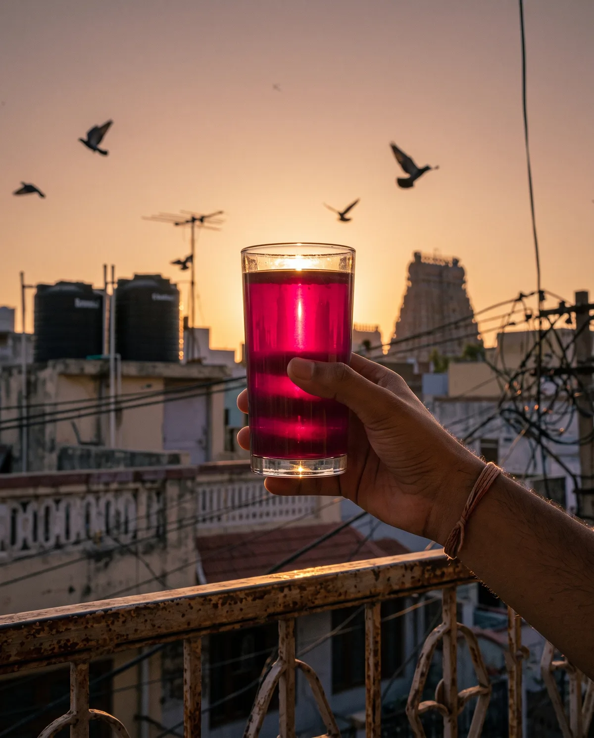
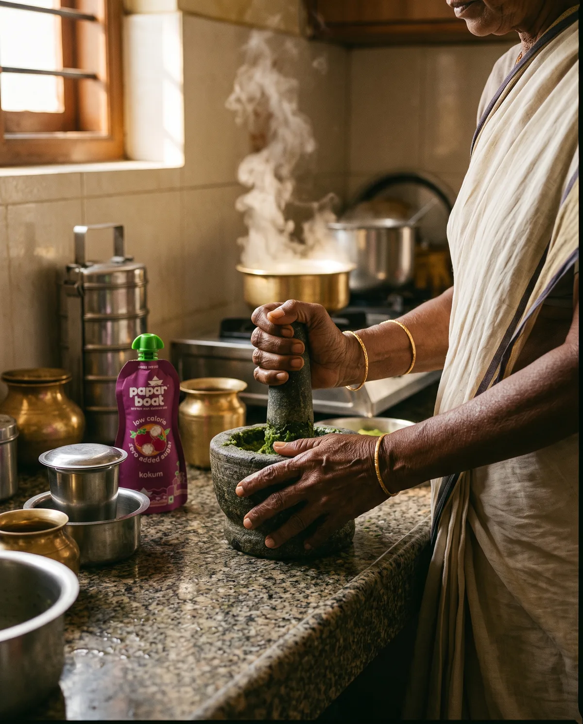
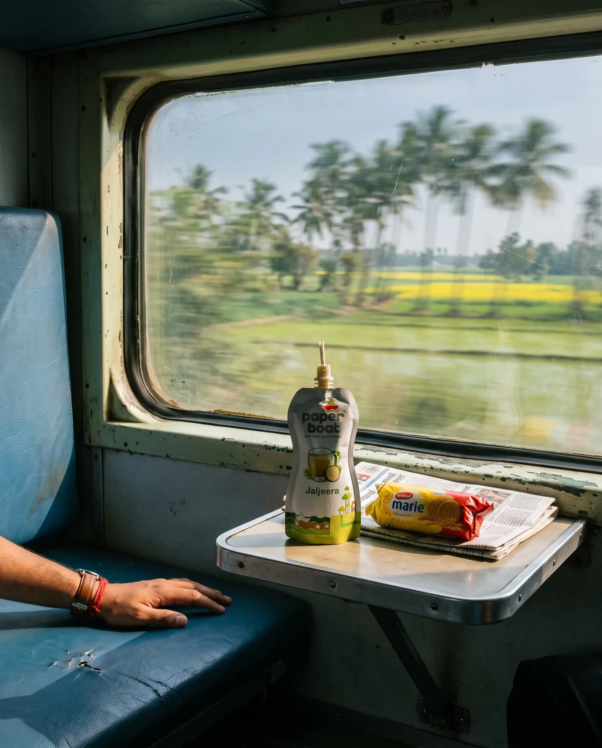
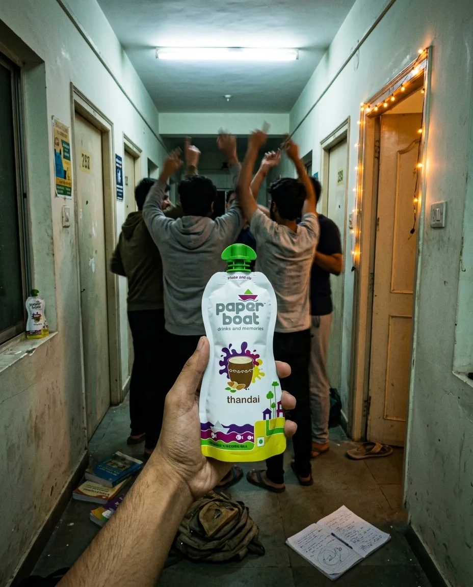
Every still in this campaign follows one compositional rule: the Paper Boat product is never the centre of the frame. It's present — sometimes a pouch, sometimes a glass of the drink — but always found by the eye, not presented to it. The way you'd find a half-finished glass in a real photograph from your own life.
The scenes aren't aspirational. They're archaeological — excavating specific Indian sensory memories that Paper Boat's audience carries but rarely sees depicted with this level of visual attention. The monsoon silence. The red-oxide floor after school. The particular colour of light on a rooftop charpai at dusk. The train window trance.
The governing idea
Illustration says "remember when." Photography says "you were there." Paper Boat's illustration generalises memory; photography particularises it. A drawing of "a kitchen" triggers the category. A photograph of brass vessels on a wet granite counter, with steam catching window light, triggers your kitchen — and every viewer fills in their own.
The work
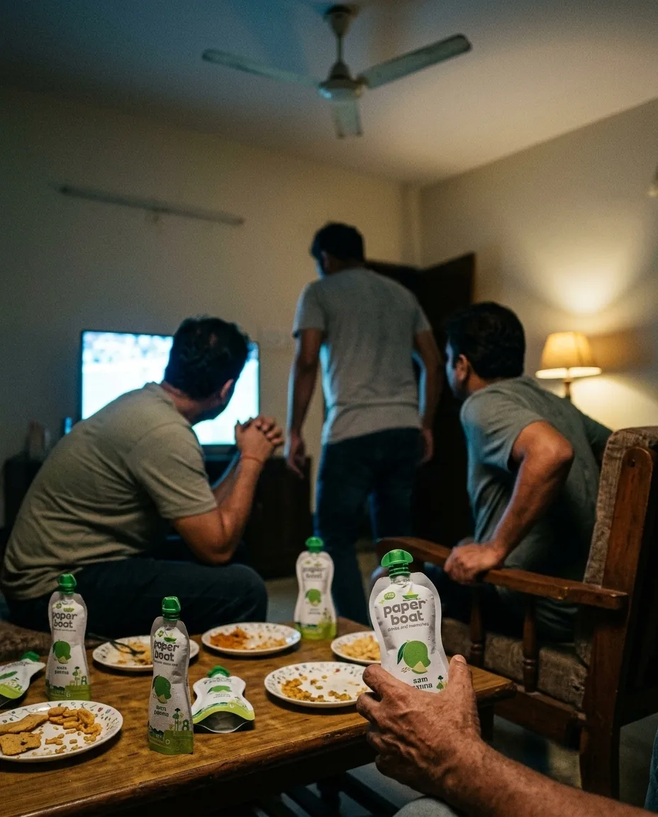
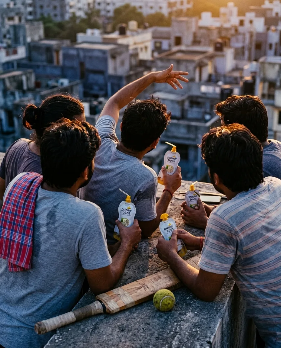
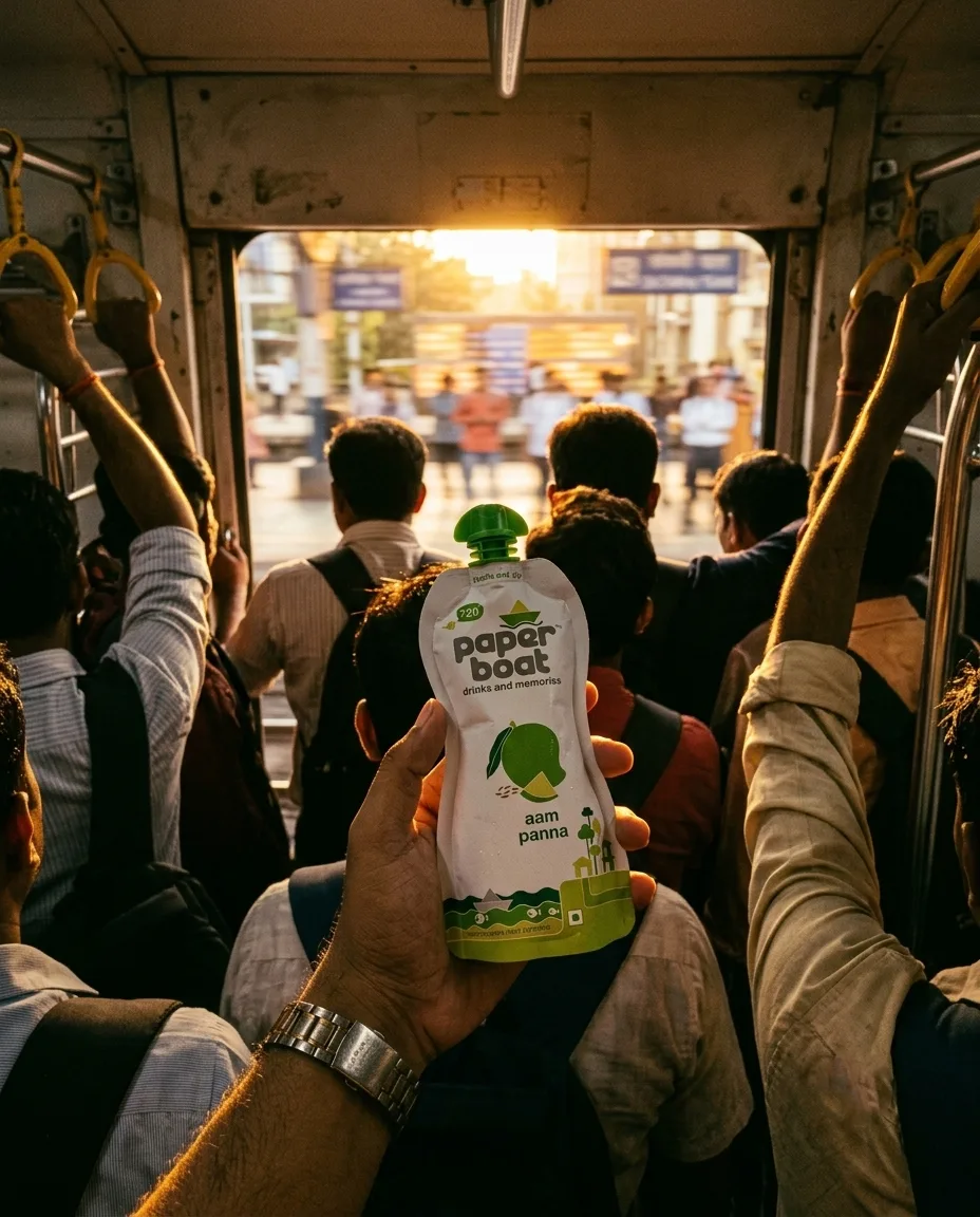
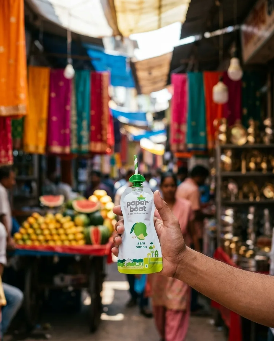
Eight stills. Each art-directed as a specific film stock, focal length, and colour palette. The product appears in every frame — with exact, real packaging — but never as the compositional centre. It is found, not presented.
Every person, kitchen, and platform shown is AI-generated — not a real photograph of a real person. Each still started as a written persona and a mood board before it was generated and art-directed to read as film.
Visual rules
Composition
Product never centred. Found at the rule-of-thirds intersection, held at hip height, or sitting on a surface among other objects. Human presence always partial: hands, feet, backs of heads, silhouettes. No faces. The viewer occupies the body, not the audience.
Colour logic
Each still has a restrained, near-monochrome palette. The drink is always the single most saturated element in the frame. It doesn't compete with the environment; it anchors it. The colour of the drink is the emotional centre of the image.
Film stocks
Every still specifies a film stock — Portra 400, Ektar 100, Superia 400, Gold 200 — because grain structure and colour science are what separate generated images from photographs that feel found. The grain isn't a filter; it's a structural decision.
Product fidelity
Where the pouch appears, it shows the real Paper Boat packaging — exact logo, label, flavour. The drink in a glass matches the actual product's colour. No approximations. If the product is in frame, it's the real thing.
Type system
Inspired by Mumbai's hand-painted railway signage. Heavy, high-contrast, brush-cut. The kind of type that belongs on weathered walls and enamel boards — not screens. Used exclusively for the campaign title and Hindi accent lines, where it anchors the visual identity in the same vernacular world the photographs depict.
Condensed serif with modern film-title-card presence. Warm enough to sit alongside the Devanagari without competing, sharp enough to hold its own in headlines. Used for all English display type, section headings, and the campaign tagline.
Condensed, utilitarian, high-legibility at large sizes. Used for statistics, section labels, and anywhere numbers or metadata need presence without weight. The contrast between Teko's industrial geometry and Yatra One's hand-painted warmth is the typographic tension the campaign runs on.
85mm f/1.4 / waist height / 4:5 portrait
Metadata, image captions, film-stock callouts. The photographer's notebook voice — precise, unadorned, present only when specificity matters.
Palette
Drawn from the world the photographs depict, not imposed on them. Terracotta and saffron from temple walls and evening light. Warm black from shadow areas shot on Portra. Parchment from aged paper and whitewashed walls. The campaign's colour system exists to feel found, not designed.
एक पूरी दुनिया जो वापस आ जाती है।
How this runs
Phase 1 — Teaser drops
Four stills released as standalone images across Paper Boat's Instagram and Twitter — no copy, no CTA, no logo lockup. Just the image and the line "पहले वाली बात." The goal is pattern interruption: Paper Boat's audience expects illustration, and these read as editorial photography. The gap between expectation and delivery is the hook.
Phase 2 — Full campaign reveal
All eight stills released as a carousel on Instagram and a long-form case study. Each still paired with a one-line memory prompt — not a product description, a sensory trigger: "The temperature drop when you crossed the threshold." "The sound the davara makes at 6am." The writing trusts the audience to complete the memory.
Phase 3 — User-generated extension
Invite the audience to share their own "पहले वाली बात" — a photograph from their life that holds a specific sensory memory. Not a contest. A prompt: "What does your pehle wali baat look like?" Paper Boat reposts the best submissions in the same warm grade and film-grain treatment. The brand becomes a curator of its audience's memories.
Media placement
Primary: Instagram carousel + stories, LinkedIn case-study format. Secondary: OOH bus-shelter panels in metro cities — the 4:5 stills map directly to bus-shelter ratios. Tertiary: print inserts in Mint Lounge and The Hindu Weekend — the editorial photography aesthetic reads as content, not advertising, in a newspaper supplement.
Who this is for
Urban Indians aged 24–38. The core Paper Boat consumer who's been with the brand for years and whose relationship to nostalgia has shifted — from abstract and whimsical to specific, textured, and personal. They respond to visual storytelling that doesn't explain itself. They've grown up. The brand's visual language should meet them there.
Why photography, not illustration
Paper Boat's illustration style works because it's warm and non-threatening — it invites nostalgia without demanding specificity. But that's also its ceiling. This isn't a critique of their existing creative. It's a proposed expansion of their visual vocabulary — a campaign-level register shift, not a brand-level overhaul. The illustrations stay on packaging, on social, on the website. The photography layer runs alongside, for moments when the brand wants to speak at a different depth.
The cinematic specificity — actual film stocks, deliberate focal lengths, imperfect grain — is what keeps these from reading as "AI product shots." They read as photographs because they're art-directed as photographs, with the same intentionality a DP would bring to a Zoya Akhtar film. The medium is AI. The eye is cinema.